Nothing’s Phones Read Like Logos Through Transparent, Retro Design
TL;DR Summary
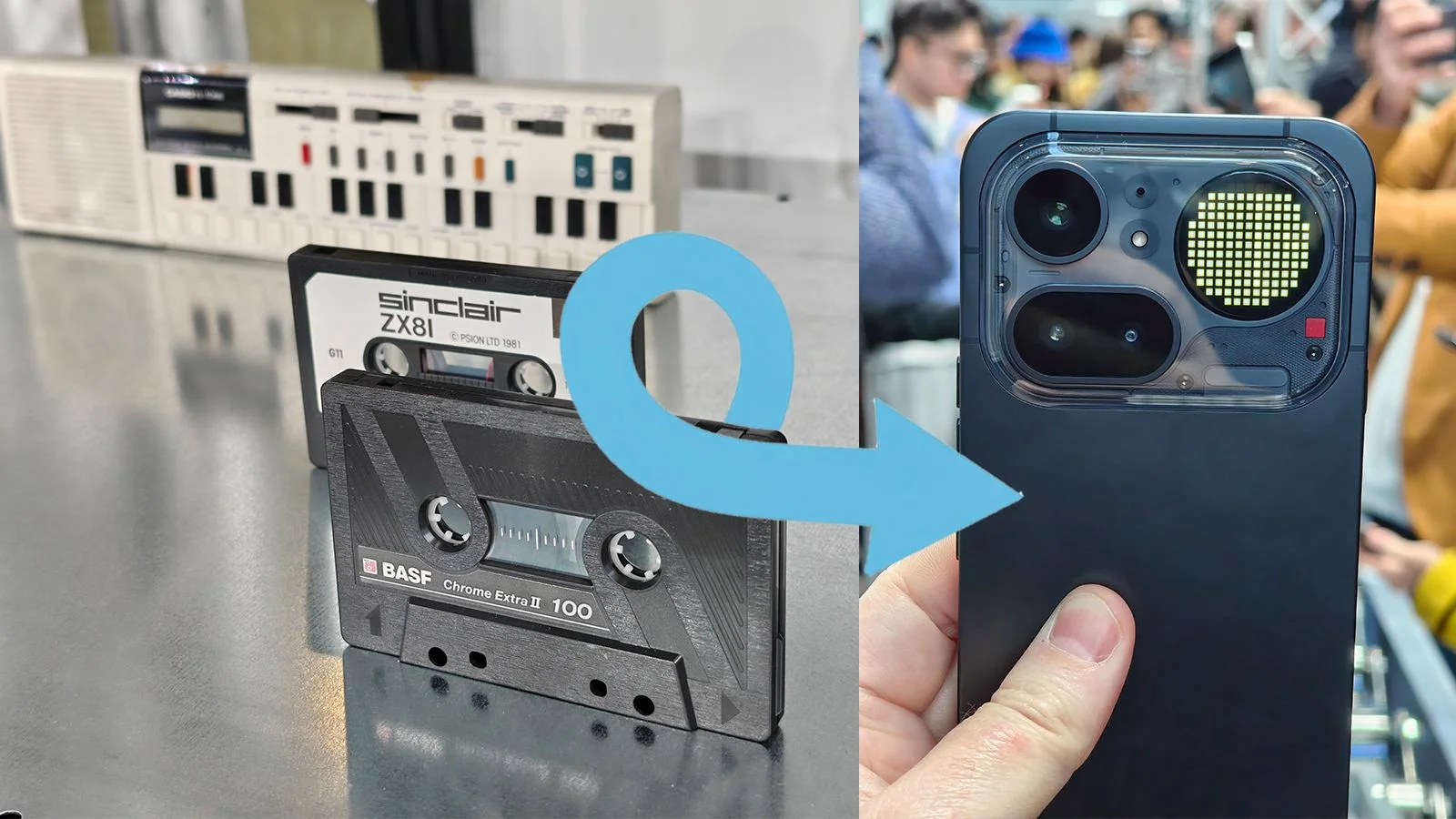
Nothing’s design team treats its devices as brand-forward objects that should be instantly recognizable, even “like a logo,” using transparent backs that reveal internal components, retro-inspired styling, and color layered inside the shell. The Nothing Phone 4(a) Pro expands this approach with more visible color and depth, aiming to disrupt a conservative smartphone market by prioritizing recognizable, disruptive design over conventional aesthetics.
- The retro tech inspiring Nothing’s "disruptive" smartphones, from Game Boys to ZX Spectrum cassettes Creative Bloq
- Nothing Phone 4a Pro: Powerful camera, metal unibody, Glyph Matrix Mashable
- This $499 phone is a spec beast, despite its ridiculous 140x zoom claim PhoneArena
- 'Apple has dug a hole for itself': why the iPhone 17e has been overshadowed by the Nothing Phone (4a) TechRadar
- Four reasons why the Nothing Phone 4a is the ideal mid-range upgrade in India Android Central
Reading Insights
Total Reads
0
Unique Readers
34
Time Saved
64 min
vs 65 min read
Condensed
100%
12,871 → 62 words
Want the full story? Read the original article
Read on Creative Bloq