
Apple Music Rebrand Uses Mineral Oil and Sound Waves to Create New Visual Identity
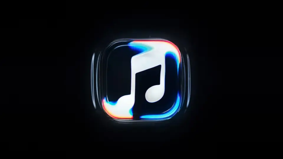
Apple has officially launched a new visual identity for Apple Music, featuring a logo and wordmark created through a physical, sound-driven process. The rebrand, which includes a new sonic signature, was developed in collaboration with British producer Fred Again and Nest Acoustics. The new design will roll out across platforms with the release of iOS 27.2 next week.
Key points
- Apple Music has unveiled a new visual identity, including a logo and wordmark, created through a physical, sound-driven process.
- The new design was developed in collaboration with British producer Fred Again and Nest Acoustics.
- The rebrand includes a new sonic signature and a rippling visual sting that will be used at the start of Apple Music videos.
- The new app icon changes from red to black-and-white, a change that has not been well-received by some users.
- The new design is expected to roll out across platforms with the release of iOS 27.2 and macOS 27.2 next week.
Background
Apple has been gradually rolling out its new design language, Liquid Glass, across its software since 2025. The new Apple Music logo was first spotted in iOS 27.2 beta 3 and previously appeared in unrelated Instagram Reels and the branding for the newly opened Apple Music Hall venue in London. The official website still displays the old design, but the shift mirrors Apple's gradual rebranding approach seen with Apple TV.
How outlets are covering it
Engadget emphasizes the practical effects used to create the logo, noting that Apple etched the logo on the glass floor of a small tank, filled it with mineral oil, and used an instrument to play a short series of tones to cause the oil to ripple. The Verge highlights the collaboration with Fred Again and Nest Acoustics, noting that the new sound is a key part of the rebrand. Wallpaper* focuses on the experimental approach, using musical frequencies to create rippling, liquid forms, and notes that the project took months of experimentation. AppleInsider points out that the new design is very reminiscent of Apple's Liquid Glass redesign and that the black-and-white app icon has not been well-received by some users.
Why it matters
The new visual identity for Apple Music is a significant change that will affect how the service is perceived by users. The use of a physical, sound-driven process to create the logo is a unique approach that sets Apple apart from other tech companies. The new design is also expected to roll out across platforms with the release of iOS 27.2 and macOS 27.2, making it a major update for Apple users.
What to watch
The new design is expected to roll out across platforms with the release of iOS 27.2 and macOS 27.2 next week. Users can expect to see the new logo and wordmark in the Apple Music app and at the start of Apple Music videos.
- There's A New Apple Music Logo And It Looks Like Ripples In Water Engadget
- Apple Music has a new logo The Verge
- Apple Music’s new visual identity ripples into view – with help from Fred Again.. Wallpaper*
- Apple Music's gorgeous rebrand leans on Liquid Glass AppleInsider
- Apple Music's New Look Officially Announced MacRumors
Want the full story? Read the original reporting
Read on Engadget