
Tate McRae's 'Housewife' Single Cover Sparks Typographic Outrage
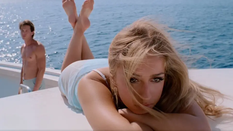
Tate McRae’s teaser for her new single 'Housewife' has ignited a debate among graphic designers due to its use of ultra-light Helvetica. While some critics view the choice as a regression to early 2000s pop aesthetics, others argue it signals a nostalgic return to form for music branding. The controversy highlights ongoing tensions between traditional typographic standards and modern pop culture trends.
Key points
- Tate McRae released a teaser for her upcoming single 'Housewife,' featuring a moody superyacht setting.
- The single’s branding utilizes an ultra-light weight of the Helvetica typeface.
- Design professionals on social media expressed strong disapproval, with some calling the choice 'grotesque.'
- Critics compared the font usage to early 2000s album covers by Britney Spears and Madonna.
- Supporters of the design argue it represents a deliberate nostalgic trend in pop music marketing.
Background
This controversy occurs as Tate McRae expands her brand beyond music, having recently launched her 'Tate 01' fragrance and fronted a Calvin Klein denim campaign. Her previous album, 'So Close To What,' debuted at number one on the Billboard 200, establishing her as a major pop figure. The current 'TM4' era marks a new phase in her career, where visual identity and cross-media branding are increasingly prominent.
How outlets are covering it
Creative Bloq frames the font choice as a 'typographical sin,' emphasizing the backlash from design professionals who view ultra-light Helvetica as outdated and inappropriate for contemporary branding. In contrast, the outlet acknowledges that some creatives see the move as a 'return to form,' drawing parallels to iconic early 2000s pop aesthetics. AOL.com, meanwhile, focuses on the visual and fashion elements of the 'Housewife' teaser, highlighting McRae’s appearance in a strappy micro minidress, without addressing the typographic controversy. This divergence illustrates how different media outlets prioritize either design critique or celebrity fashion in covering the same release.
Why it matters
The debate underscores the enduring influence of typography in music marketing and the polarizing nature of nostalgic design trends. It also reflects the broader tension between traditional design standards and the evolving aesthetics of pop culture, where brand identity often extends beyond music into fashion and lifestyle products.
What to watch
Tate McRae is expected to release the full 'Housewife' single and potentially more content related to her 'TM4' era. The ongoing discussion may influence how other artists and brands approach typographic choices in their marketing materials, particularly as nostalgia continues to shape contemporary pop aesthetics.
Want the full story? Read the original reporting
Read on Creative Bloq