Tag

Typography

All articles tagged with #typography

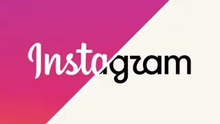
Instagram's logo refresh sparks debate over a warmer look and a blander identity
branding21 days ago

Instagram's logo refresh sparks debate over a warmer look and a blander identity

Instagram unveiled a refreshed logo and wordmark after a decade, introducing a warmer script typeface (Instagram Pen) and a new handwriting vibe while keeping the camera glyph and a subtler gradient in a revised brand system. While the update aims to feel more personal and future‑facing, many users have reacted by calling the result bland and less legible, with jokes about ‘Instagwam’ and nostalgia for Instagram’s earlier Polaroid roots, suggesting the change may not clearly communicate the brand identity.

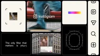
Instagram refreshes its brand after a decade, putting creators at the center
graphic-design21 days ago

Instagram refreshes its brand after a decade, putting creators at the center

Instagram unveils its first major brand refresh in over ten years, shifting from a single iconic mood to a flexible, creator-focused identity. The redesign preserves the script wordmark while refining typography (Instagram Sans and Instagram Sans Mono), introduces Instagram Pen, and uses a viewfinder motif to emphasize image-making. The color palette becomes more restrained, with subtle light-leak gradients, so the community’s content remains the focus rather than the brand itself.

ShieldFont uses word-swapping fonts to slow AI scrapers
technology1 month ago

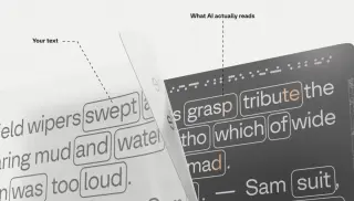
ShieldFont uses word-swapping fonts to slow AI scrapers

A new open-source project called ShieldFont aims to deter AI scrapers by using extended GSUB-based substitutions in OpenType fonts, making page text appear normal to human readers while delivering gibberish to automated crawlers. The font maps words through predefined pools (about 250) so about a quarter of words are swapped into semantically related, unreadable forms, complicating data ingestion without completely blocking access. While it can slow or confuse scrapers, it’s not foolproof—OCR, targeted AI that downloads the font, or other scraping methods can bypass it, and there could be SEO and accessibility drawbacks. ShieldFont is available as a demo, a React component, and CSS/CDN-ready options, with the project described as alpha and evolving.

Ghost Font Reveals AI Blind Spots by Hiding Letters in Motion
technology1 month ago

Ghost Font Reveals AI Blind Spots by Hiding Letters in Motion

Ghost Font, an experimental typography project by designer Eric Lu, hides letters inside thousands of moving dots that humans read through motion perception, while many AI vision models struggle to decode the pattern; the effect vanishes when paused, it's not encryption, and with frame-by-frame analysis or more advanced vision techniques AI can eventually read the message, highlighting the gap between human and machine perception.

Taylor Swift nails wedding branding with a clever ampersand logo
design1 month ago

Taylor Swift nails wedding branding with a clever ampersand logo

Taylor Swift’s wedding branding demonstrates how a simple, well-executed logo can tell a big story: a bold pink-and-black billboard reading 'JUST&T MARRIED!' uses an ampersand that hides Travis’s initial, there’s an interlocking 'T&T' monogram for keepsakes, and the branding extends to trademark-level protection. The piece highlights Swift’s meticulous approach to branding assets—from font choices to logos—showing that great design scales from stadium tours to a wedding.

Bucketverse Unleashed: KFC’s bold rebrand turns a bucket into a world
graphic-design2 months ago

Bucketverse Unleashed: KFC’s bold rebrand turns a bucket into a world

KFC teams with agency JKR for a 360-degree rebrand that reimagines the bucket as a world—the Bucketverse—updating the logo, typography, interiors, packaging, app design and social voice, while expanding photography and illustration and introducing a QXR (quick experience restaurant) model, all while keeping the Colonel and iconic red-and-white identity.

Everyday fonts could be sabotaging your brand’s readability — and why
design3 months ago

Everyday fonts could be sabotaging your brand’s readability — and why

A design studio ranked 10 common web fonts on readability and brand impact, finding that familiar system fonts (e.g., Arial Narrow, Microsoft Sans Serif, Century Gothic, Tahoma, Arial) often hamper readability due to cramped spacing or dull differentiation, while others like Trebuchet MS, Times New Roman, Vendana, Georgia and Candara vary in performance. The takeaway is to test typography across devices, avoid condensed or overly generic body fonts, and prioritize open spacing and distinct letterforms to preserve user experience and brand perception.

The Impact of AI on Font Design
technology1 year ago

The Impact of AI on Font Design

Monotype explores the potential of AI to revolutionize typography by enabling adaptive, emotionally responsive fonts and streamlining design processes, but experts remain cautious about AI's impact on creative control and the future of design workflows, drawing parallels to historical industrialization debates and the dot-com bubble.

"Microsoft Word Switches Default Typeface to Aptos: What You Need to Know"
technology2 years ago

"Microsoft Word Switches Default Typeface to Aptos: What You Need to Know"

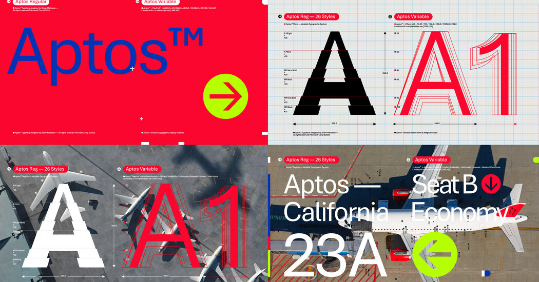
Microsoft Word has changed its default typeface from Calibri to Aptos after 17 years, affecting the look of PowerPoint, Outlook, and Excel. The change, while subtle for many users, has excited typography enthusiasts. The decision to switch was driven by a desire to bring something new and fresh designed for the modern era of computing, according to Jon Friedman, Microsoft's corporate vice president for design and research.

"Google Fonts and Chrome Receive Material 3 Redesigns for Enhanced User Experience"
technology3 years ago

"Google Fonts and Chrome Receive Material 3 Redesigns for Enhanced User Experience"

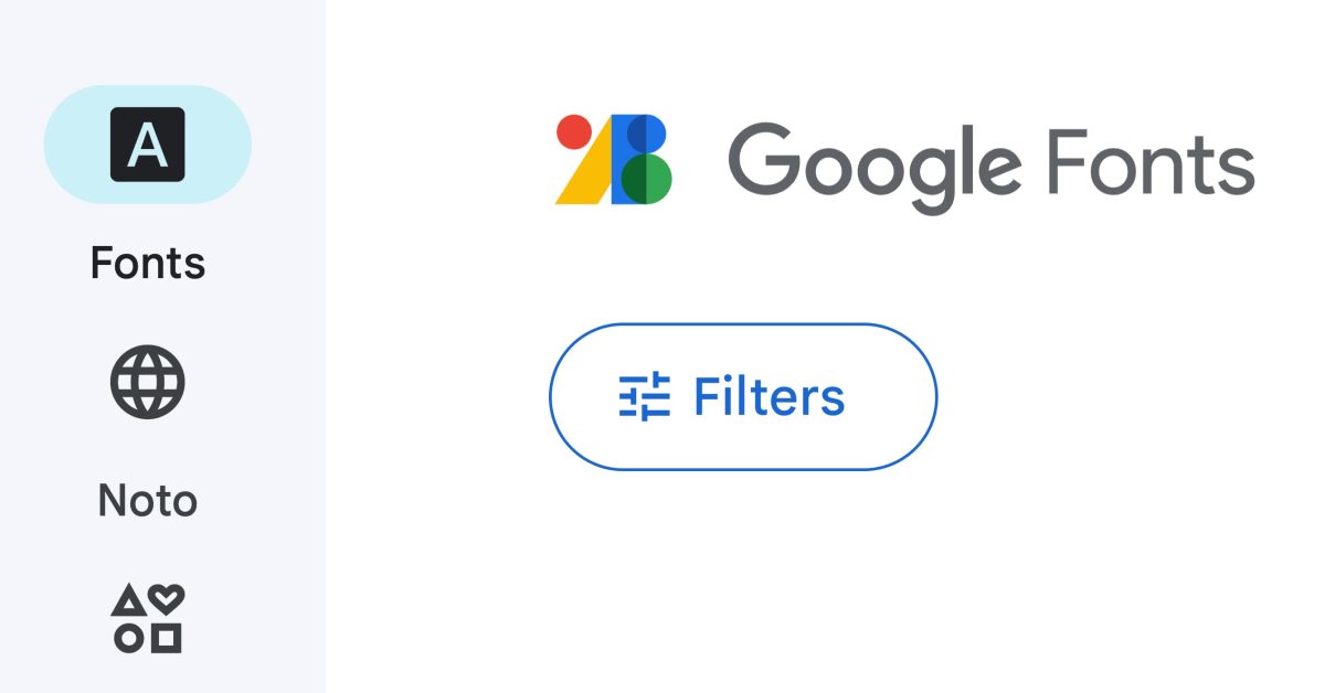
Google Fonts has undergone a Material 3 redesign on its mobile web platform, showcasing the design language's features. The update includes a navigation rail on desktop and a bottom bar on mobile, with five tabs for Fonts, Noto, Icons, Knowledge, and FAQ. The redesign offers an improved search experience, customizable font options, and a library of typography guides. The website features a light/dark theme and accentuates blue as the accent color.

Ideogram's Impressive AI Image Generator Revolutionizes Text Rendering
artificial-intelligence3 years ago

Ideogram's Impressive AI Image Generator Revolutionizes Text Rendering

Ideogram, a new AI image generator, has shown promising results in generating clear and readable text in images, unlike its competitors. While other generators struggle with rendering text, Ideogram's AI can produce typography and logos effectively. However, it still has room for improvement as it sometimes produces mistakes or gibberish. The AI is particularly proficient with short phrases but struggles with longer ones. Ideogram recently launched and is currently available to the public, with potential monetization in the future.