
Instagram refreshes its brand after a decade, putting creators at the center
TL;DR
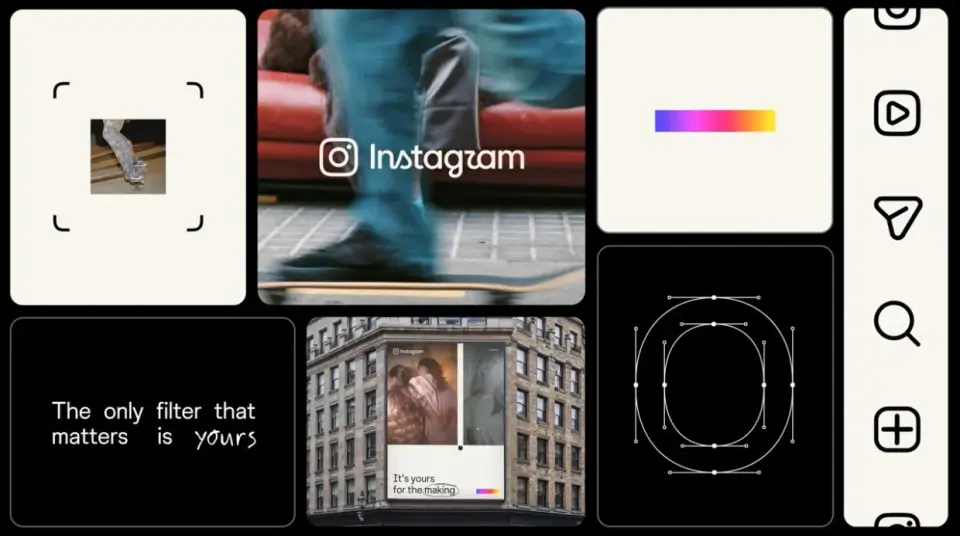
Instagram unveils its first major brand refresh in over ten years, shifting from a single iconic mood to a flexible, creator-focused identity. The redesign preserves the script wordmark while refining typography (Instagram Sans and Instagram Sans Mono), introduces Instagram Pen, and uses a viewfinder motif to emphasize image-making. The color palette becomes more restrained, with subtle light-leak gradients, so the community’s content remains the focus rather than the brand itself.
- “Instagram has evolved”: the process and craft behind Instagram’s first major refresh in over ten years It's Nice That
- Instagram introduces a redesigned wordmark TechCrunch
- This is Instagram’s new logo The Verge
- The new Instagram logo is the perfect embodiment of AI slop Ars Technica
- Instagram Unveils ‘More Modern’ New Logo, and People Are Already Making Fun of It Variety
Want the full story? Read the original reporting
Read on It's Nice That