
Mixed Reactions to New 'We ❤️ NYC' Campaign Launch
TL;DR Summary
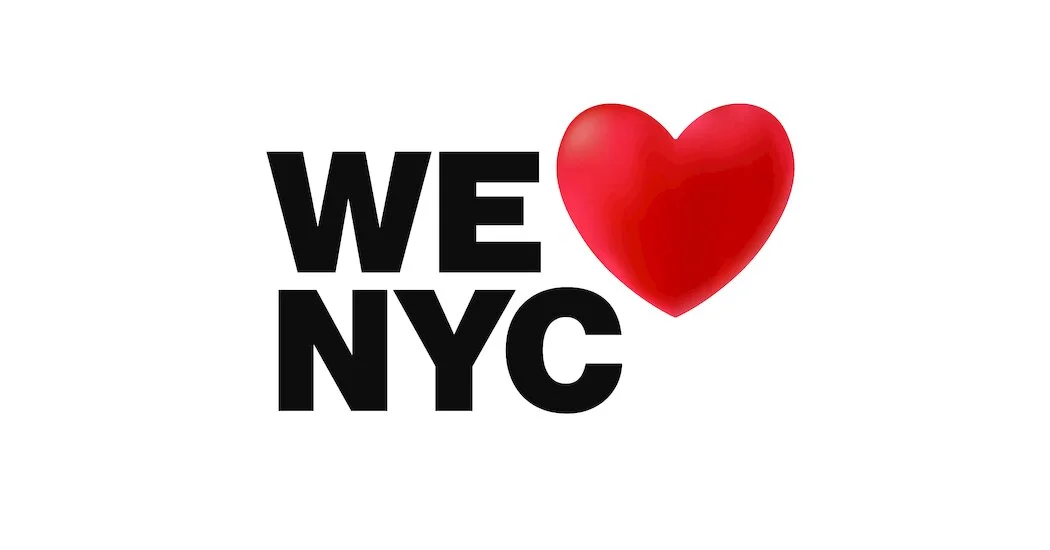
The new "We ❤️ NYC" logo, designed to promote unity and positivity in the city, has received harsh criticism on social media for its design. Some have criticized the sans-serif font, the shading of the heart, and the fact that the characters don't line up. Others have questioned the city's priorities, with one person asking if they could focus on the housing crisis instead. Some New Yorkers have even taken it upon themselves to create their own versions of the logo. Despite the criticism, some have praised the logo for its inclusivity and use of the subway font.
- These New Yorkers Hate the New ‘We ❤️ NYC’ Logo The New York Times
- 'We NYC' Is Here. Why? Curbed
- 'We Love NYC' campaign kicks off in New York City PIX11 News
- The new 'We ❤️ NYC' campaign has sent the internet into a frenzy Gothamist
- Adams, Hochul launch 'We Love NYC' ad campaign to foster 'positive attitude' New York Daily News
Reading Insights
Total Reads
0
Unique Readers
14
Time Saved
4 min
vs 5 min read
Condensed
90%
970 → 98 words
Want the full story? Read the original article
Read on The New York Times