
"Decades-Long Battle Shaped Highway Sign Fonts"
TL;DR
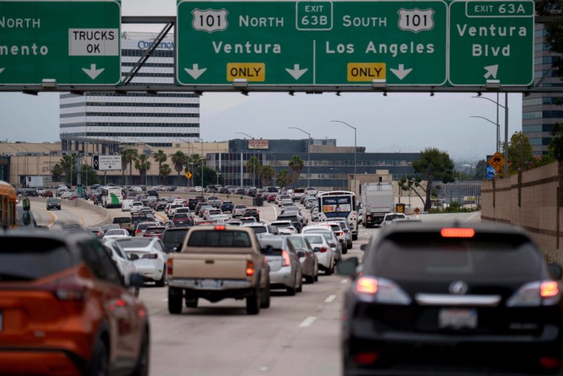
The U.S. has seen a decades-long debate over the best font for highway signs, oscillating between Highway Gothic and Clearview. Initially adopted in 1948, Highway Gothic faced readability issues with reflective signs, leading to the creation of Clearview in 2004. Despite initial approval, Clearview's endorsement was rescinded in 2016 but reinstated in 2018, resulting in a mix of both fonts on U.S. highways today.
Topics:technologytransportation#clearview#federal-highway-administration#fonts#highway-gothic#highway-signs#transportation
Want the full story? Read the original reporting
Read on KTLA Los Angeles