Tag

Fonts

All articles tagged with #fonts

Everyday fonts could be sabotaging your brand’s readability — and why
design1 day ago

Everyday fonts could be sabotaging your brand’s readability — and why

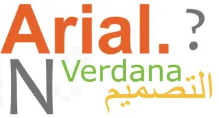
A design studio ranked 10 common web fonts on readability and brand impact, finding that familiar system fonts (e.g., Arial Narrow, Microsoft Sans Serif, Century Gothic, Tahoma, Arial) often hamper readability due to cramped spacing or dull differentiation, while others like Trebuchet MS, Times New Roman, Vendana, Georgia and Candara vary in performance. The takeaway is to test typography across devices, avoid condensed or overly generic body fonts, and prioritize open spacing and distinct letterforms to preserve user experience and brand perception.

"Decades-Long Battle Reflected in Highway Sign Fonts"
transportation2 years ago

"Decades-Long Battle Reflected in Highway Sign Fonts"

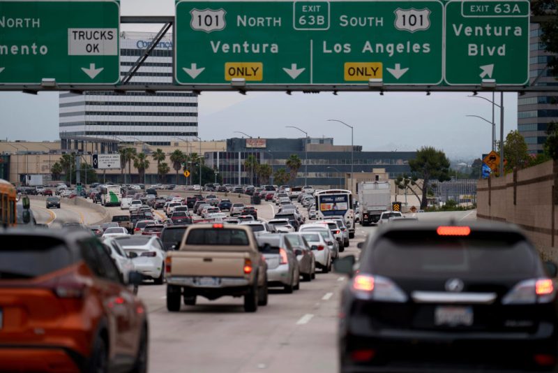
The U.S. has been embroiled in a decades-long debate over the best font for highway signs, oscillating between Highway Gothic and Clearview. Highway Gothic, adopted in 1948, faced readability issues with reflective signs, leading to the creation of Clearview in 2004. Despite initial approval, Clearview's endorsement was rescinded in 2016 but reinstated in 2018, resulting in a mix of both fonts on U.S. roadways today.

"Decades-Long Battle Shaped Highway Sign Fonts"
transportation2 years ago

"Decades-Long Battle Shaped Highway Sign Fonts"

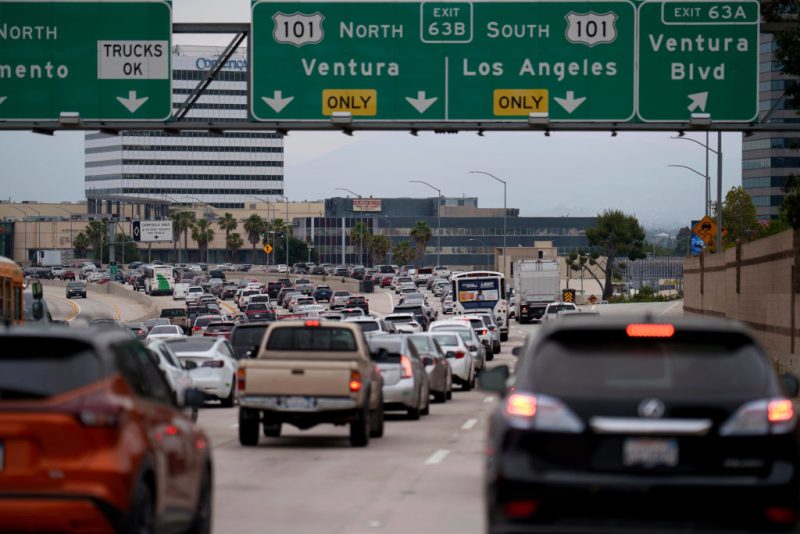
The U.S. has seen a decades-long debate over the best font for highway signs, oscillating between Highway Gothic and Clearview. Initially adopted in 1948, Highway Gothic faced readability issues with reflective signs, leading to the creation of Clearview in 2004. Despite initial approval, Clearview's endorsement was rescinded in 2016 but reinstated in 2018, resulting in a mix of both fonts on U.S. highways today.

"Microsoft's Small Change Sparks Big User Discontent: Feeling Gaslit by My Own Computer"
technology2 years ago

"Microsoft's Small Change Sparks Big User Discontent: Feeling Gaslit by My Own Computer"

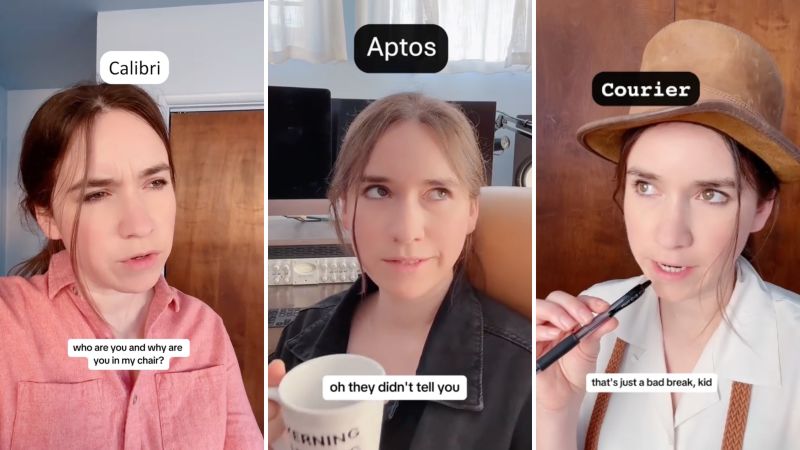
Microsoft's decision to replace the default font Calibri with Aptos after 17 years has sparked strong reactions from users, with some feeling "gaslit by their own computer." Social media users, including Stef Luthin and Elle Cordova, have shared their surprise and humor over the font change, while others like lawyer Joel Payne and doctoral student Katherine Stockton have embraced the new font. Despite the mixed reactions, Microsoft stands by its decision, citing evolving font technology and changing preferences over time.

Microsoft Ditches Calibri for Aptos as Office's New Default Font
technology2 years ago

Microsoft Ditches Calibri for Aptos as Office's New Default Font

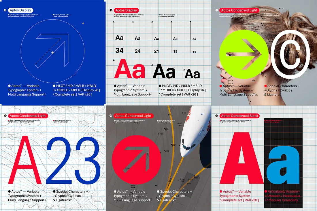
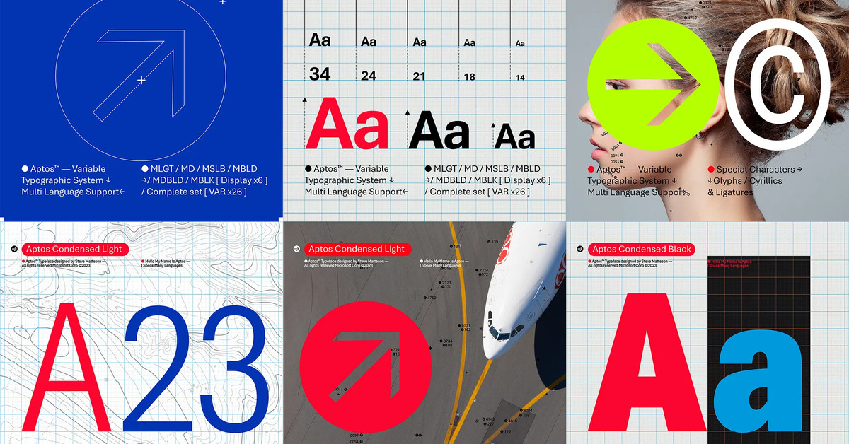
Microsoft has replaced its default font Calibri with Aptos as the new official font for all Microsoft Office apps. Aptos, formerly known as Bierstadt, is a static font in the neo-grotesque sans serif tradition, chosen from five fonts commissioned by Microsoft to replace Calibri. The change affects millions of users, as Microsoft has over 345 million paid seats on Office 365. Aptos offers useful features such as a distinctive lowercase "l" and a more "humanist" touch. The font will start appearing as the default across Word, Outlook, PowerPoint, and Excel, with a gradual rollout to all customers in the coming months.

Introducing Aptos: Microsoft Office's Sleek New Default Font
technology2 years ago

Introducing Aptos: Microsoft Office's Sleek New Default Font

Microsoft is replacing its default font, Calibri, with a new sans-serif typeface called Aptos. Aptos, previously known as Bierstadt, was chosen as the default font after years of feedback and will start appearing across Word, Outlook, PowerPoint, and Excel for millions of users. Created by leading type designer Steve Matteson, Aptos is inspired by mid-20th-century Swiss typography and features clearly cut-off stroke endings with subtle softening. Calibri will still be available in the font menu alongside Times New Roman and Arial. Microsoft aims to make its software more expressive and inclusive with the introduction of Aptos and other design features.