
Controversy Erupts Over Google Maps' Colorful Update
TL;DR Summary
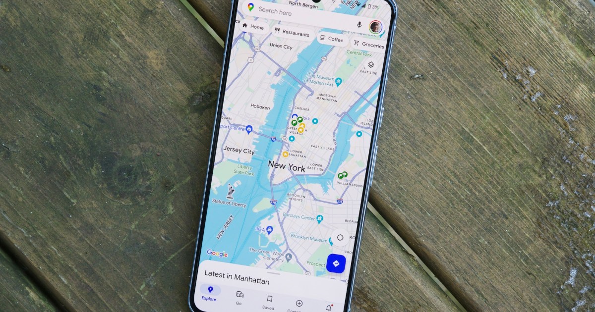
Google Maps has received a major redesign, but the changes have been met with widespread criticism. Users have described the new design as generic and lacking in usability, while professional UI designers have also expressed concerns. Additionally, the new color scheme is not color-blind friendly, making it difficult for color-blind individuals to use the app effectively. Some have even started a petition calling for Google to reverse the color changes. The redesign has also drawn comparisons to Apple Maps, with critics noting that Google Maps still has cluttered elements that hinder the user experience.
- Google Maps got a major update, and people hate it Digital Trends
- What do you think about the new colors in Google Maps? [Poll] 9to5Google
- Google Maps changed colors and some people are upset, including a former designer CNBC
- Users Launch Petition Against the New Google Maps Interface autoevolution
- Google Maps rolls out new colors on Android, iOS, and web 9to5Google
Reading Insights
Total Reads
0
Unique Readers
11
Time Saved
5 min
vs 6 min read
Condensed
92%
1,153 → 94 words
Want the full story? Read the original article
Read on Digital Trends