iOS 27.2 resolves long-standing complaints about Apple Podcasts by splitting the 'Up Next' queue into two distinct sections: 'New Episodes' for latest content and 'Continue Playing' for unfinished listens.
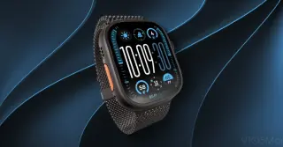
Leaker pdfu identified hidden code in the watchOS 27.2 beta that suggests Apple is developing a new screenshot experience for the Apple Watch. This update would mimic the iPhone’s current system, allowing users to preview, share, or delete screenshots immediately after capture, rather than sending them directly to the Photos app. The feature is currently behind a disabled flag, indicating it may not launch with the initial 27.2 release but is likely coming soon.
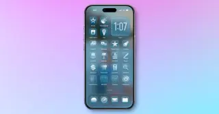
An opinion piece argues iOS and iPadOS should adopt Material You–style color theming driven by icon colors (with optional wallpaper matching) to expand customization beyond light/dark modes, noting Apple’s prior icon tinting steps and Mac’s system tint options, as well as recent color theming in Xcode.
Ubisoft’s The Division Resurgence arrived on Steam as a mobile-to-PC port, but players are criticizing the PC release for a cluttered, mobile-style UI and aggressive microtransactions that feel pay-to-win, compounded by minimal PC optimization and 2019-era hardware recommendations, resulting in a mixed Steam reception (roughly 45% positive).
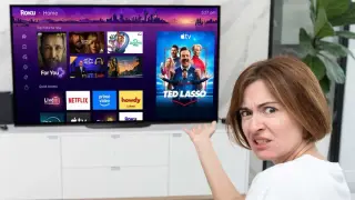
Roku’s late-May 2026 home screen redesign emphasizes content discovery with AI-driven recommendations, a prominent Top Picks for You row, and a Quick Access panel, plus a collapsible left menu and smaller app tiles. While Roku doesn’t offer a full revert, users can disable the Recommended rows and Quick Access and set Tile size to Large to approximate the classic 3×3 app grid, with changes taking effect immediately.
Apple’s iOS 27 Beta 5 previews a more customizable camera with addable widgets, quick-access tools, and controls like flash, live mode, depth, exposure, timers, and style filters, plus a refined Liquid Glass UI across more system elements (including the volume HUD and Control Center). The beta cadence is accelerating, with Developer Beta 5 on Aug 3 and Public Beta 3 on Aug 5, followed by weekly updates from mid-August ahead of a mid-September final release.
WhatsApp is rolling out a redesigned iOS chat UI with rounder, softer message bubbles similar to iMessage and cleaner media previews without borders, following recent Liquid Glass-based interface updates.
Kotaku reports widespread user backlash after Roku's June UI overhaul, which replaces a fast, simple home screen with a cluttered, ad-heavy layout driven by recommendations, introduces bugs, and prompts calls to revert or offer an old-interface option.
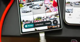
Google Photos is beginning to roll out an iOS-style floating bottom bar on Android, adding quick-access options for Photos, Collections, Create, and a separate Search button. The update is currently phased, with some devices like Galaxy Z Fold 7 seeing the new UI while others such as Pixel 10 Pro still run the old layout; the change appears to be a styling update shared with other Google apps and will spread with the rollout.
Blizzard will fix World of Warcraft's long-standing autoloot annoyance by making autoloot account-wide in the Curse of Ula'tek patch, which also adds the Coiled Isle zone, a new eight-boss raid, world bosses, delves, a dungeon season, and assorted UI improvements.
YouTube Shorts is removing the visible dislike button, replacing the like with a heart, adding a TikTok-inspired Clear Screen mode, and introducing a 2x playback speed option, plus new feed-tuning controls like Not Interested and Don't Recommend; rollout is regional and ongoing.
Reddit co-founder Steve Huffman says the internet will expand beyond traditional screens, with voice and audio interfaces possibly becoming the primary way we interact with computers; keyboards and mice won’t disappear, but we’ll see more listening and voice-enabled experiences as people stay connected over shared interests. Reddit’s long-term goal is to reach 1 billion users, a topic Huffman touched on during Cannes Lions, noting that while voice UI isn’t being actively built yet, it’s on the team’s radar as part of the internet’s evolution.
Roku is standardizing the home screen across Roku TVs, replacing brand-specific designs with a single Roku City purple backdrop and a small brand logo, bringing consistent navigation, easier software updates, and potential for deeper cross-device features as more manufacturers like TCL adopt the approach.
Roku now lets eligible devices manually switch to the company’s redesigned home screen via Settings > Home Screen > Home Screen Update, enabling early opt-in before the automatic rollout. The switch is one-way and cannot be undone, though users can customize the new UI to resemble the old layout. The update brings features like Top Picks for You, a customizable Quick Access area, Destinations hubs, a unified view of subscriptions, improved search, and a collapsible side menu, along with new widgets such as Your Daily Scoop and Roku City. Availability is staggered by device and account, with some users seeing a “coming soon” indicator; international expansion is anticipated. Those who wait will receive the update automatically as the rollout progresses, and users are advised to ensure a stable internet connection and latest software before updating.”,
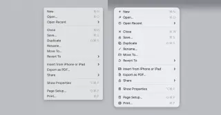
Apple is reiterating Macintosh UI guidelines that icons should be used sparingly, following criticism of macOS 26 Tahoe’s menu icons. The updated macOS 27 guidance emphasizes using icons to highlight common actions and features, aiming for a cleaner, less cluttered menu experience; observers view this as a corrective turn for Apple’s UI design.