macOS 27 Drops Tahoe’s Menu Icons in a Move Toward Simpler UI
TL;DR Summary
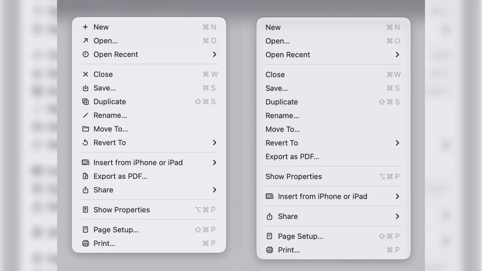
Apple’s macOS 27 Golden Gate reverses macOS Tahoe’s icon-heavy menu design by removing most menu item icons (keeping them only where genuinely useful) and updating Human Interface Guidelines to use icons sparingly. The change signals a shift toward a more minimalist UI and is currently in developer beta, with a public beta next month and a fall general release.
- macOS 27 Golden Gate Reverses a Divisive Tahoe Design Choice MacRumors
- How Apple broke the mold to give its OS 27 updates a rock-solid foundation Macworld
- Every MacBook getting macOS 27: Is yours on the list? Mashable
- Apple again warns developers not to do what Apple did in macOS 26 Tahoe 9to5Mac
- Bypass Siri AI Waitlist on macOS 27 Golden Gate Beta: Here's How MacRumors
Reading Insights
Total Reads
0
Unique Readers
6
Time Saved
7 min
vs 8 min read
Condensed
96%
1,515 → 59 words
Want the full story? Read the original article
Read on MacRumors