
Decoding the Controversial Message in Ozempic's Logo
TL;DR
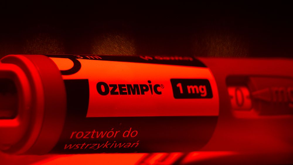
The logo for Novo Nordisk's diabetes medication, Ozempic, has a clever design that resembles both a needle and a human figure with a slim waist. While the logo has received praise for its creativity, some have raised concerns about promoting an unhealthy relationship with weight, as Ozempic is not approved for weight loss. Despite this controversy, the logo has become popular and recognizable.
Topics:healthgraphic-design#controversy#drug-branding#graphic-design#logo-design#ozempic#pharmaceutical-industry
- The Ozempic logo has a clever but controversial secret Creative Bloq
- Dental considerations for people taking Ozempic The Dental Economics Network
- Why a hidden message in Ozempic's logo represents a big shift in drug branding Fast Company
- Pointers With Portela: What to Know About Ozempic Dermatology Times
- View Full Coverage on Google News
Want the full story? Read the original reporting
Read on Creative Bloq