
Google rolls out gradient-powered icons for Gmail, Drive, Calendar and more
TL;DR
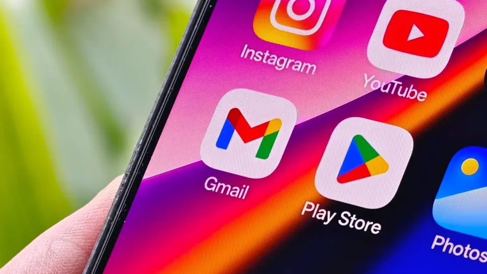
Google is gradually rolling out a gradient redesign for Workspace icons, updating apps like Gmail, Drive, Docs, Calendar and Tasks with colorful gradients. The new icons are visible on Google's homepage launcher, but in-app icons haven’t all updated yet. The refresh moves away from the old four-color scheme to softer gradients (Calendar and Meet show distinct blue/yellow shifts; Keep and Tasks also look different). A broader rollout is expected around Google I/O 2026.
- Google's new gradient icons for Gmail, Calendar, Drive and more are finally rolling out Android Central
- Gradient Google icon redesign starts rolling out 9to5Google
- Google is making its icons more playful The Daily Star
- Google's redesigned app icons are rolling out, whether you want them or not Android Authority
- Those new Google gradient icons are finally showing up for users PiunikaWeb
Want the full story? Read the original reporting
Read on Android Central