Google Workspace icons get a gradient, rounded redesign ahead of I/O
TL;DR Summary
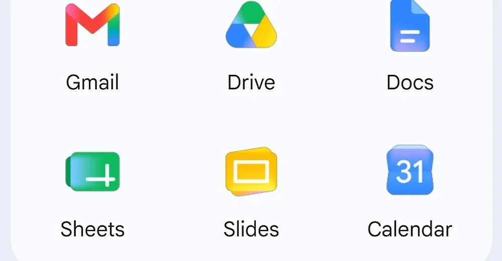
Google is rolling out a redesigned gradient-style Workspace icon set with rounded shapes; several apps move to single-color icons (Chat, Meet, Calendar) to stand out, while Docs/Sheets/Slides largely keep their color schemes (Sheets/Slides swap to landscape); Drive gains rounded corners and Keep drops borders, with the changes arriving as Google I/O nears.
- Google is rolling out its redesigned Workspace app icons The Verge
- Gradient Google icon redesign starts rolling out 9to5Google
- Google's Much-Improved App Icons Are Rolling Out Now Engadget
- Google's new gradient icons for Gmail, Calendar, Drive and more are finally rolling out Android Central
- Google is making its icons more playful The Daily Star
Reading Insights
Total Reads
0
Unique Readers
2
Time Saved
45 min
vs 46 min read
Condensed
99%
9,060 → 52 words
Want the full story? Read the original article
Read on The Verge