
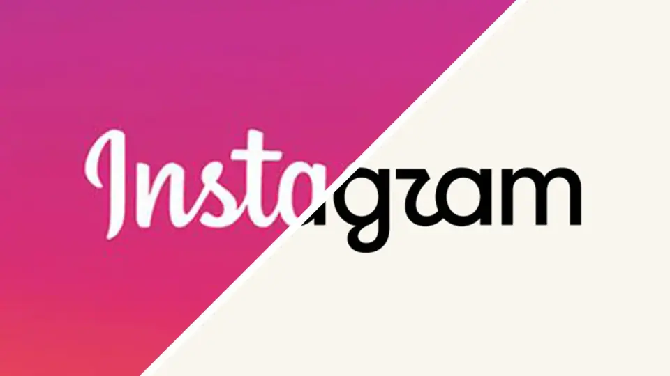
Instagram's logo refresh sparks debate over a warmer look and a blander identity
TL;DR
Instagram unveiled a refreshed logo and wordmark after a decade, introducing a warmer script typeface (Instagram Pen) and a new handwriting vibe while keeping the camera glyph and a subtler gradient in a revised brand system. While the update aims to feel more personal and future‑facing, many users have reacted by calling the result bland and less legible, with jokes about ‘Instagwam’ and nostalgia for Instagram’s earlier Polaroid roots, suggesting the change may not clearly communicate the brand identity.
Topics:entertainmentbranding#branding#design#instagram#logo-redesign#note-extra-tag-may-exceed-top-5#typography
- Instagram just redesigned its logo for the worst possible reason Creative Bloq
- Instagram introduces a redesigned wordmark TechCrunch
- This is Instagram’s new logo The Verge
- “Instagram has evolved”: the process and craft behind Instagram’s first major refresh in over ten years It's Nice That
- The new Instagram logo is the perfect embodiment of AI slop arstechnica.com
Want the full story? Read the original reporting
Read on Creative Bloq