
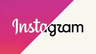
Instagram's logo refresh sparks debate over a warmer look and a blander identity
Instagram unveiled a refreshed logo and wordmark after a decade, introducing a warmer script typeface (Instagram Pen) and a new handwriting vibe while keeping the camera glyph and a subtler gradient in a revised brand system. While the update aims to feel more personal and future‑facing, many users have reacted by calling the result bland and less legible, with jokes about ‘Instagwam’ and nostalgia for Instagram’s earlier Polaroid roots, suggesting the change may not clearly communicate the brand identity.