
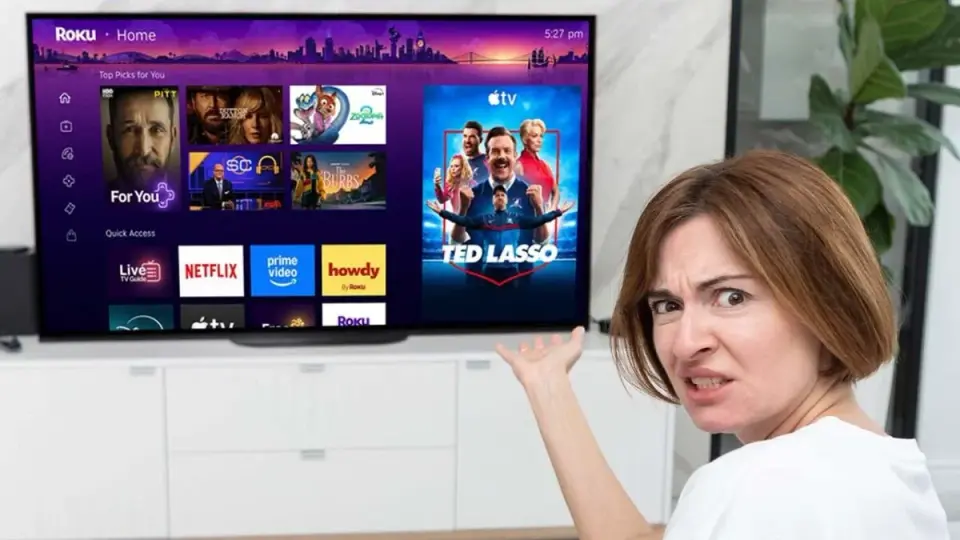
Roku's New Home Screen Update Triggers Uproar Over Ads and Clutter
TL;DR
Kotaku reports widespread user backlash after Roku's June UI overhaul, which replaces a fast, simple home screen with a cluttered, ad-heavy layout driven by recommendations, introduces bugs, and prompts calls to revert or offer an old-interface option.
Want the full story? Read the original reporting
Read on Kotaku