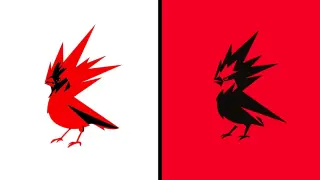
CDPR's redesigned firebird logo ignites a surprising design backlash
CD Projekt Red refreshed its Raróg emblem to a sharper, redder firebird as part of a branding update. The redesign has sparked a wave of unusually heated backlash on X, with critics reading politics and woke vibes into the logo, even as the company explains the red color and mythic bird symbolize energy and creativity and notes the change is evolutionary, not revolutionary, tying into its Witcher-forward roadmap.