
Climate Visuals Exclude Local Communities, Limiting Action
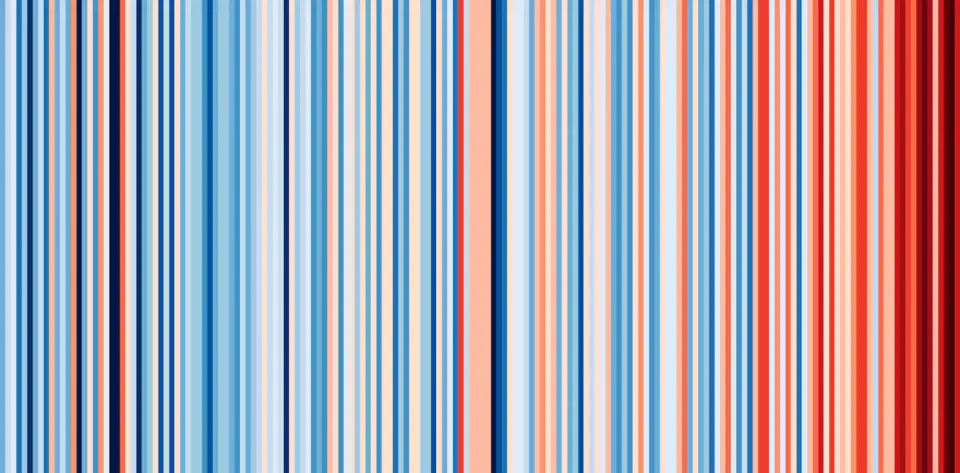
Research from Manchester Metropolitan University reveals that popular climate data visualizations, such as warming stripes, often exclude specific local communities like Pacific islands. While these graphics effectively convey global trends, they can obscure the experiences of vulnerable populations, potentially limiting the sense of agency and direct action among viewers. The study highlights a gap between global accuracy and local visibility in climate storytelling.
Key points
- A study involving 34 participants in the UK and Poland found that climate visualizations evoke mixed emotions, ranging from worry and anger to curiosity and aesthetic pleasure.
- Participants noted that visually appealing graphics, like warming stripes, can initially mask the severity of the data until the viewer understands the underlying meaning, shifting their emotional response from enjoyment to distress.
- A meteorologist from Tonga highlighted a critical gap: global visualizations often lack the granular data required to represent specific small islands, leaving local communities invisible in the narrative.
- The research suggests that emotional responses to climate data do not automatically translate into action; viewers are more likely to act if they feel a sense of agency at a local or national level.
- The study argues that climate communication must balance global scale with local context to ensure that the people behind the numbers are visible and that audiences understand how they can contribute to solutions.
Background
This analysis builds on previous discussions regarding how data presentation influences public perception, such as the 2026 mid-term election tracker which demonstrated how aggregated data can simplify complex political realities. It also contrasts with earlier findings on brain scans and PTSD, which highlighted how individual biological responses to trauma vary, underscoring the importance of individual context in data-driven narratives.
Why it matters
The effectiveness of climate communication depends not just on accuracy but on inclusivity. If visualizations exclude vulnerable communities, they may fail to inspire the necessary local action and political engagement required to address climate change. Understanding these gaps is crucial for developing more equitable and effective climate messaging strategies.
What to watch
Researchers and communicators are likely to focus on developing visualizations that integrate local data with global trends. This may involve creating interactive tools that allow users to generate specific regional or island-level climate data, ensuring that all communities are represented. Additionally, there may be a shift towards emphasizing agency and actionable steps in climate messaging to bridge the gap between emotional response and direct action.
Want the full story? Read the original reporting
Read on The Conversation