Tag

Data Visualization

All articles tagged with #data visualization

Data Isn't Enough: Relearning Risk Communication to Fight Future Outbreaks
opinion27 days ago

Data Isn't Enough: Relearning Risk Communication to Fight Future Outbreaks

An opinion piece arguing that outbreaks demand not just medical solutions but clear, contextual risk communication. As health agencies shrink and journalism declines, data dashboards can mislead without caveats, so rebuilding original reporting, enhancing scientist engagement with the public, and transparent messaging are essential to guide proportional actions during hantavirus, Ebola, measles, and future outbreaks.

California Tops 2025 Craft Beer Output as Small States Punch Above Their Weight
business28 days ago

California Tops 2025 Craft Beer Output as Small States Punch Above Their Weight

California led 2025 U.S. craft beer production with 3.45 million barrels from 939 craft breweries (about one-sixth of all craft beer). Seven states exceeded 1 million barrels, together making up 53% of roughly 22 million barrels produced that year. Vermont and Maine stood out relative to population, while Mississippi had the fewest barrels. The data, from the Brewers Association and used in Voronoi visuals, also notes that ownership changes can move volumes out of the craft category (e.g., New Belgium, Bell’s), helping explain shifts across states.

Jet-Tracking Tool Sparks Debate Over Billionaire Escape Signals
technology1 month ago

Jet-Tracking Tool Sparks Debate Over Billionaire Escape Signals

A programmer launched the Apocalypse Early Warning System (AEWS), a public data tool that maps global private-jet activity and scores deviations from typical flight patterns to indicate potential, but not guaranteed, civilization-threatening signals. A score of 5 flags unusually high activity—often tied to holidays or major events—and the highest spike to date occurred on April 6 after Iran’s retaliation attacks; the project sits among broader efforts to reveal patterns in public data and inform conversations about wealth, power, and governance.

Most People Can't Power an Hour of Air Conditioning
energy4 months ago

Most People Can't Power an Hour of Air Conditioning

Billions in energy-poor countries cannot power even a single hour of air conditioning, leaving extreme heat a daily health and productivity burden. In many places, the average per-person daily electricity is far below what an hour of AC needs (India ~44 minutes, Nigeria ~13 minutes, South Sudan ~4.4), and AC ownership remains very low (roughly 5–16% in several large economies). Even affordable cooling like electric fans is out of reach for many. Solving this requires more affordable, cleaner electricity and more efficient cooling, even as AC accounts for about 3% of greenhouse gas emissions and demand could triple by 2050.

Top Data Visualizations and Graphics of 2025
technology6 months ago

Top Data Visualizations and Graphics of 2025

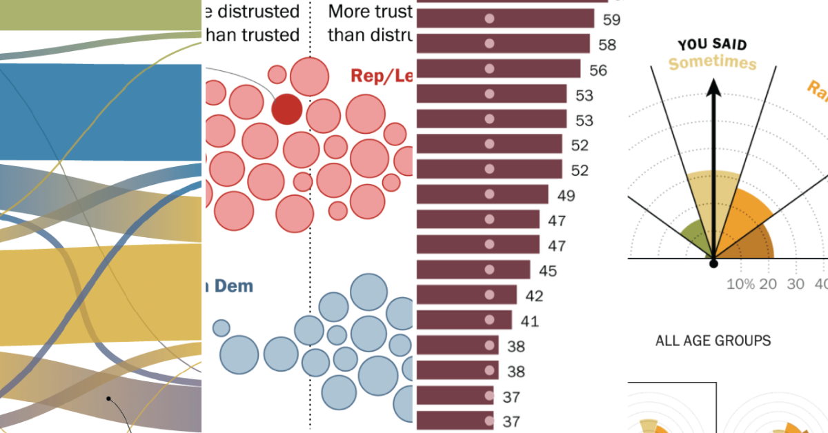
Pew Research Center's 2025 data visualizations showcase innovative techniques like alluvial diagrams, annotated charts, and nature-inspired visuals to effectively communicate research findings on topics such as political shifts, social norms, and global demographics, emphasizing clarity, engagement, and storytelling across digital platforms.

"Optimizing Mario Kart 8: Finding the Ultimate Racer Using Pareto Analysis"
gaming2 years ago

"Optimizing Mario Kart 8: Finding the Ultimate Racer Using Pareto Analysis"

Data scientist Antoine Mayerowitz applies the Pareto front, a principle from 19th-century economist Vilfredo Pareto, to determine the best character, vehicle, and wheels combinations in Mario Kart 8. By narrowing down the 703,560 possible decisions to 25,704, Mayerowitz plots the potential builds on a chart, revealing the most optimal choices based on speed and acceleration. The best build for prioritizing speed and acceleration is Peach on the Teddy Buggy with roller tires and the Cloud Glider.

"Data Journalism: Mona Chalabi's Coverage of Palestine"
art-and-culture2 years ago

"Data Journalism: Mona Chalabi's Coverage of Palestine"

Mona Chalabi, known for her award-winning data visualizations, discusses her work on Palestine, emphasizing the importance of accuracy and adding to the conversation. She addresses the challenges of posting about Palestine on social media, the poetic nature of her work, and the need to contextualize her focus on Palestine within her broader work on marginalization. Chalabi also reflects on the biases and challenges she faces when covering this topic, expressing her commitment to continuing to shed light on marginalized issues.

"Uncovering the Secrets: Harnessing the Hidden Camera Feature in Microsoft Excel"
technology2 years ago

"Uncovering the Secrets: Harnessing the Hidden Camera Feature in Microsoft Excel"

Microsoft Excel has a hidden Camera tool that allows users to take dynamic snapshots of data and paste them as linked images within the workbook, enabling automatic updates when the underlying data changes. The tool is not enabled by default but can be added to the Quick Access Toolbar through Excel Options. Once added, users can easily capture and paste data or charts as linked images, making tasks such as creating dynamic dashboards, managing large datasets, and creating micro-charts more efficient.

"Melodies from the Cosmos: NASA's Telescope Data Transformed into Mesmerizing Music"
science-and-technology2 years ago

"Melodies from the Cosmos: NASA's Telescope Data Transformed into Mesmerizing Music"

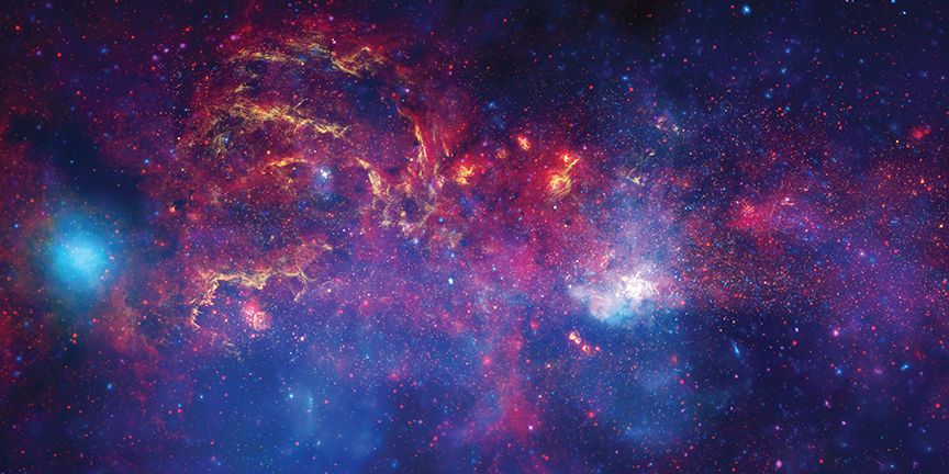
Montreal composer Sophie Kastner has collaborated with NASA to create a piece of music using data from the Hubble, Chandra, and Spitzer telescopes. The music, titled "Where Parallel Lines Converge," is inspired by an image of the center of the Milky Way and aims to convey the movement and mystery of deep space. Kastner worked with scientist Kimberly Arcand to translate the data into sound, allowing listeners to experience the wonders of the cosmos through music. The project highlights the connection between science and art, showing how data visualization can be used to create beautiful and meaningful compositions.

Mastering the art of captivating scientific data visualizations
science-and-technology2 years ago

Mastering the art of captivating scientific data visualizations

Data analysis and visualization can be a creative and artistic process, bridging the gap between science and art. Artists and scientists alike use data to tell stories, evoke emotions, and invite questions. Choosing the right visualization for the data is crucial, as different visualizations can convey different insights. The process of curating and analyzing data is itself a creative endeavor. However, translating data into artistic mediums raises questions about the trustworthiness and nature of data. The intersection of art and science allows for a deeper understanding of the complex world around us.

science-and-technology2 years ago

"Google's 'A Passage of Water' Transforms NASA's Water Data into an Immersive Experience"

NASA has collaborated with Google Arts & Culture and artist Yiyun Kang to create an interactive digital experience called "A Passage of Water," which uses data from NASA's GRACE and SWOT missions to illustrate the impact of climate change on Earth's water cycle. The project will be released online ahead of the United Nations' Climate Change Conference of Parties (COP 28) and will also have a physical installation at the conference. This collaboration is part of NASA's efforts to share its Earth science data with the public and inform decision-makers on climate change mitigation and adaptation.

"NASA Transforms Real Space Data into Mesmerizing Milky Way Symphony"
science-and-astronomy2 years ago

"NASA Transforms Real Space Data into Mesmerizing Milky Way Symphony"

Composer Sophie Kastner has transformed data from NASA's Chandra, Hubble, and Spitzer telescopes into a symphony titled "Where Parallel Lines Converge." The composition draws from a specific image of the Galactic Center, featuring a double star system, arched filaments, and the supermassive black hole Sagittarius A*. The sonification project at NASA's Chandra X-ray center aims to translate space data into sounds, allowing visually impaired individuals to connect with the wonders of the universe. Kastner's composition provides a unique way to interact with the night sky, creating short vignettes of the data and treating it as if writing a film score.

Google Bard AI Chatbot: New Math and Data Visualization Features Empower Teenagers Worldwide
technology2 years ago

Google Bard AI Chatbot: New Math and Data Visualization Features Empower Teenagers Worldwide

Google has released an update to its AI-powered platform, Bard, which includes new math and data visualization features. The expansion aims to provide a safer and more enriching educational experience for English-speaking teenagers. Bard now offers step-by-step guidance for solving math problems and the ability to create informative charts from user-generated data. Common Sense Media has introduced an AI ratings system, with Bard receiving three stars for its creative applications but also raising concerns about potential biases and misinformation. Marketers are reminded to align AI-generated content with ethical practices when targeting younger users.

"Microsoft Integrates Python into Excel for Enhanced Functionality"
technology2 years ago

"Microsoft Integrates Python into Excel for Enhanced Functionality"

Microsoft has announced the Public Preview of Python in Excel, allowing users to integrate Python and Excel analytics within the same Excel grid. The collaboration with Anaconda Distribution for Python running in Azure enables the use of popular Python libraries such as pandas, statsmodels, Matplotlib, and seaborn. While in Preview, Python in Excel will be included with Microsoft 365 subscriptions, but some functionality will require a paid license after the Preview. Python creator Guido van Rossum expressed excitement about the integration, highlighting the potential for interesting new uses and praising the Excel team.