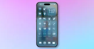
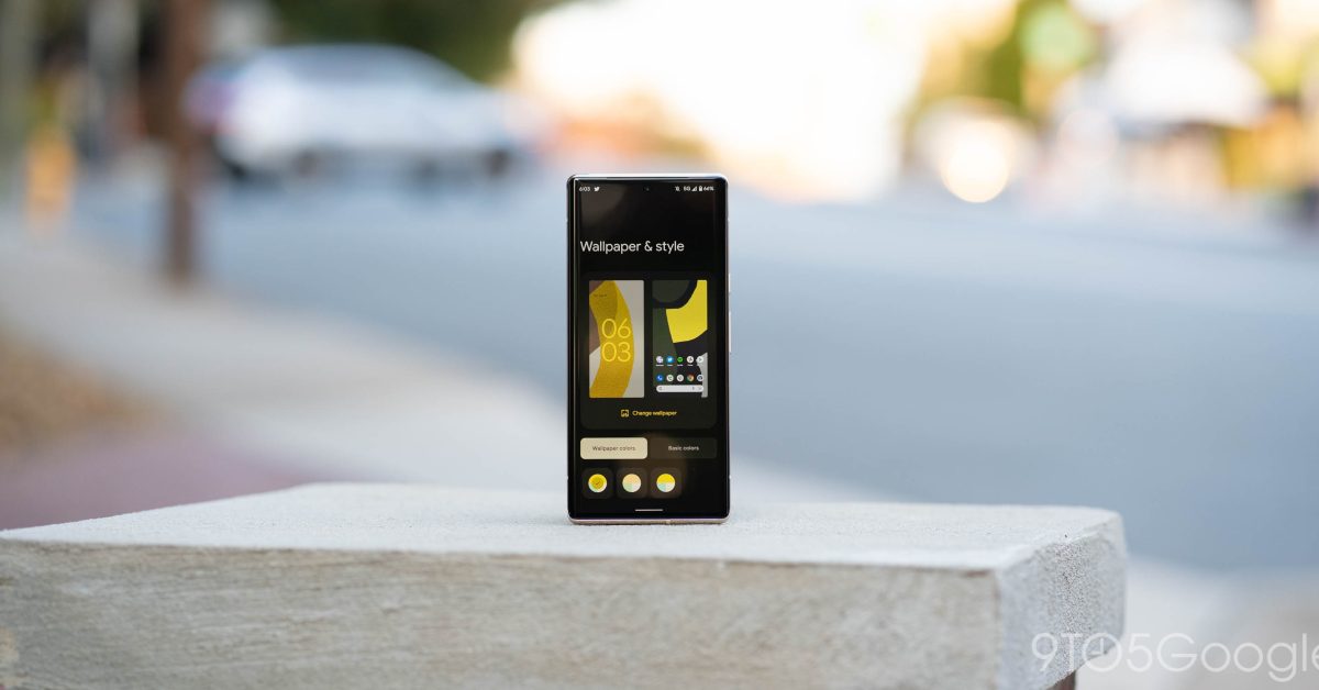
An opinion piece argues iOS and iPadOS should adopt Material You–style color theming driven by icon colors (with optional wallpaper matching) to expand customization beyond light/dark modes, noting Apple’s prior icon tinting steps and Mac’s system tint options, as well as recent color theming in Xcode.
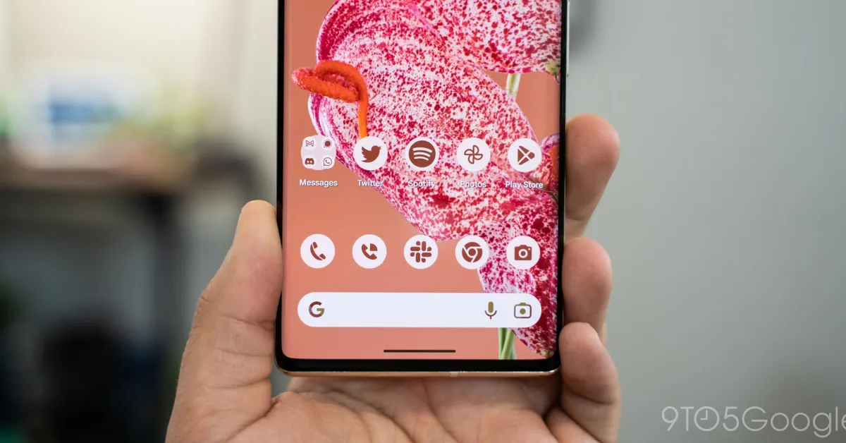
Android 16's upcoming update introduces auto-theming for app icons, which will automatically tint icons based on user-selected color themes, and mandates developers to allow users to modify app themes, aligning with Google's design guidelines and addressing legal concerns over icon customization.
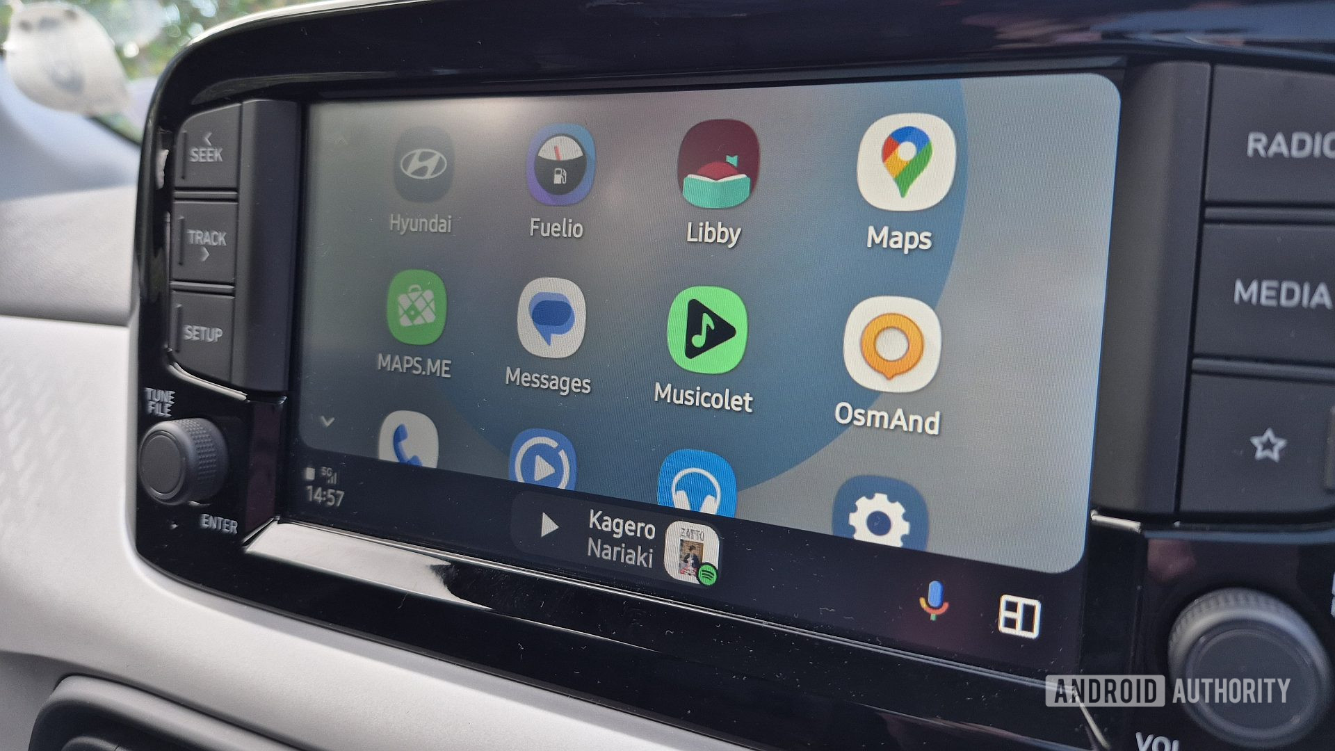
Google is considering reversing a controversial UI change in Android Auto that used wallpaper colors for the media background, potentially returning to album art backgrounds, but has introduced a new visual bug affecting text display in multi-window mode. The company is testing these updates in upcoming versions, aiming to improve user experience while addressing previous complaints.
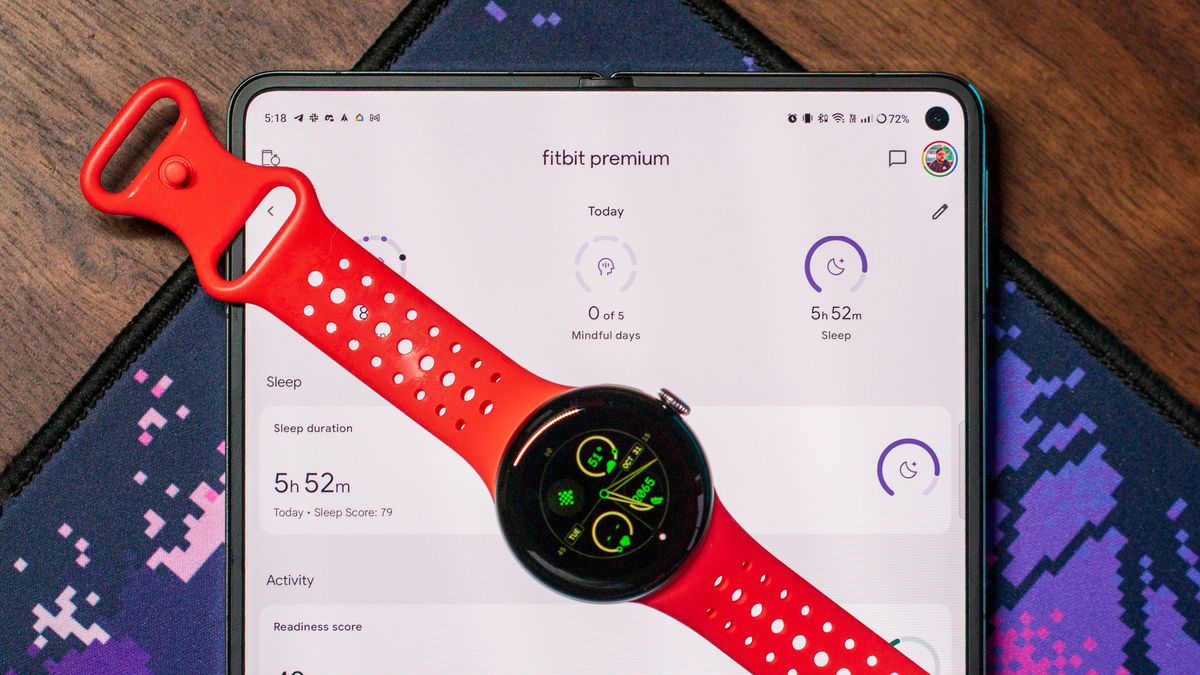
Google has been revamping the Fitbit app to align with its Material You design language since acquiring the company in 2021. The ongoing effort, detailed by the Fitbit UX team, began two years ago and emphasizes personalization and user-centric design. The app now features light backgrounds, rich colors, and softer tones, reflecting a focus on holistic health experiences. In addition to design, the team aims to provide easily digestible health and fitness metrics, with a focus on actionable insights. The integration of Google's smartwatch expertise and Fitbit's health experience is evident in the Pixel Watch 2, making it a compelling choice for Fitbit enthusiasts.
Google is working on improving its Material You theming in upcoming Android releases with a new "Color contrast" customization option, allowing users to manually adjust the appearance of UI elements to appear darker. This feature, currently found in the Android 14 beta, is expected to be formally introduced in Android 15 under "Color and motion" in the accessibility settings. The new option aims to enhance user customization within the Material You theming, providing further control over the appearance of UI elements and text contrast.
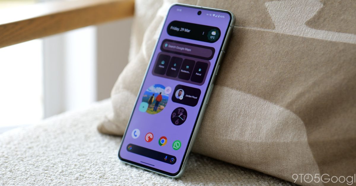
Google has introduced a variety of first-party app widgets for Android, including the "At a Glance" widget for time, date, and weather, the Google Clock widget with various clock styles, the Conversations widget for tracking active chats, and the Digital Wellbeing widget for monitoring app usage. Other notable widgets include Google Drive for easy file access, Google Maps for navigation, Google Keep for note-taking, and Google Translate for language translation. Additionally, there are widgets for Google Arts & Culture, Google Contacts, Chrome, Fitbit, and Google TV, offering a range of functionalities from art exploration to fitness tracking and TV remote control.
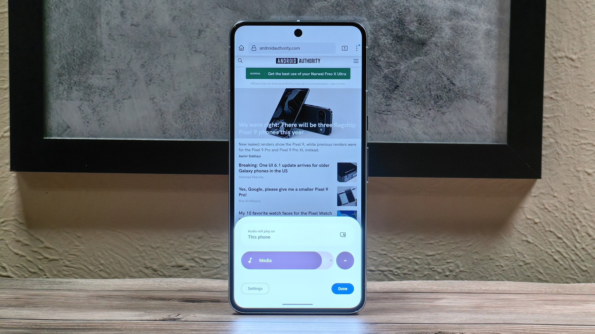
Android 15 is set to introduce a major redesign of the volume panel, featuring collapsible controls and a new UI with thicker sliders and persistent media output shortcuts. The update aligns with Google's Material You design language and includes playful animations, additional controls for spatial audio and "noise control," and a more modern look that deviates from the current volume panel design.
Google Keep for Android is preparing to introduce a floating bottom bar with a pill-shaped container featuring an oblong button for creating a new note at the center, flanked by options for creating a new list and a new drawing. The new design, enabled with version 5.24.x, takes up less space than the current interface, allowing users to see more content. Google has removed the options for creating new audio and photo notes from the bottom bar, but users should still be able to attach both when inside a note.
Fitbit has revealed a redesign of its Sleep stats page as part of the Material You revamp, featuring tabs for Day, Week, Month, and Year, and displaying last night's sleep stats upfront. The redesign also includes changes to the sleep animal page. Additionally, Fitbit has shown off unreleased redesigns for the Health Metrics page and other features, indicating ongoing updates to the app's design.
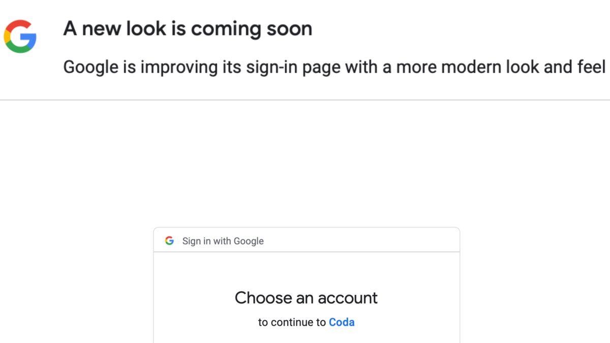
Google is teasing a redesign for the Sign in with Google page, promising a "more modern look and feel" through a banner message. The redesign could potentially incorporate Material You elements or emphasize Passkeys as an alternative to traditional passwords. While specific details are not yet available, the upcoming changes aim to enhance the user experience and security of the sign-in process.
Google is teasing a redesign of its sign-in page, with users of the "Sign in with Google" OAuth option being greeted with a message about the upcoming change. While details about the redesign are currently scarce, it is expected to feature a more modern look and feel, possibly incorporating Material You design elements. Providing advance notice of the redesign is a smart move by Google to help users stay vigilant against potential phishing attempts.
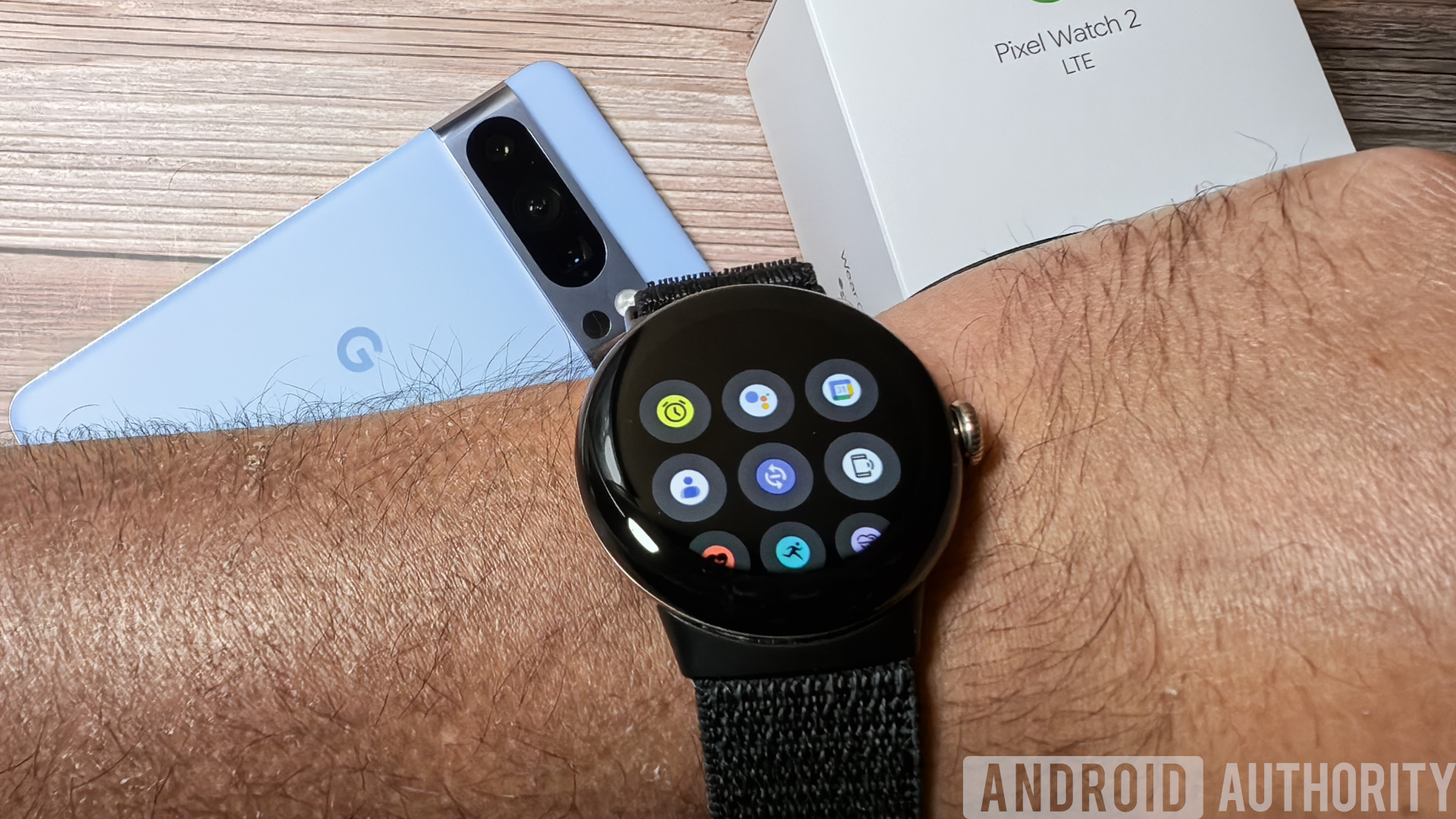
Google is set to bring Material You dynamic theming support and a new three-column grid view to Wear OS 4, with hints that these features will be included in the upcoming March 2024 Pixel Feature Drop. The dynamic theming support will allow the system theme to match the current watch face, while the grid view app launcher is expected to be exclusive to the Pixel Watch family. These changes are already present in the current Wear OS 4 build for the Pixel Watch and Pixel Watch 2, and may soon be available on other smartwatches that update to the latest Wear OS 4 build distributed by Google.
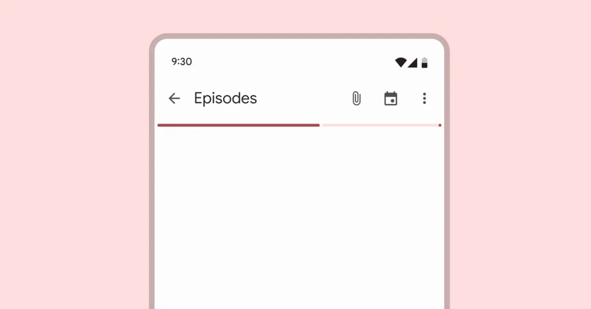
Google's Material You design is getting an updated progress bar with rounded corners and a gap between the active indicator and the track, along with higher contrast and an end stop indicator for accessibility. This new design has been implemented in some Android apps like Play Store and Google Photos, and is part of Google's ongoing refinement of Material You components.
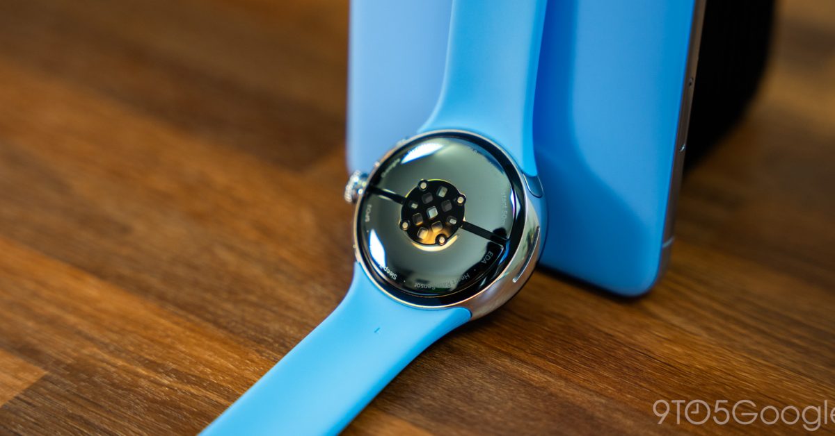
The Pixel Watch's user interface (UI) is showing signs of Dynamic Color theming, with blue icons appearing in Quick Settings and the heart rate graph turning blue in Tiles. This suggests that Wear OS is preparing for full theming support. The update to Wear OS System UI has rolled out, but not all users have received the blue treatment yet. It remains to be seen how users will be able to choose the color, whether through watch face accents or a predefined list in the Settings app.
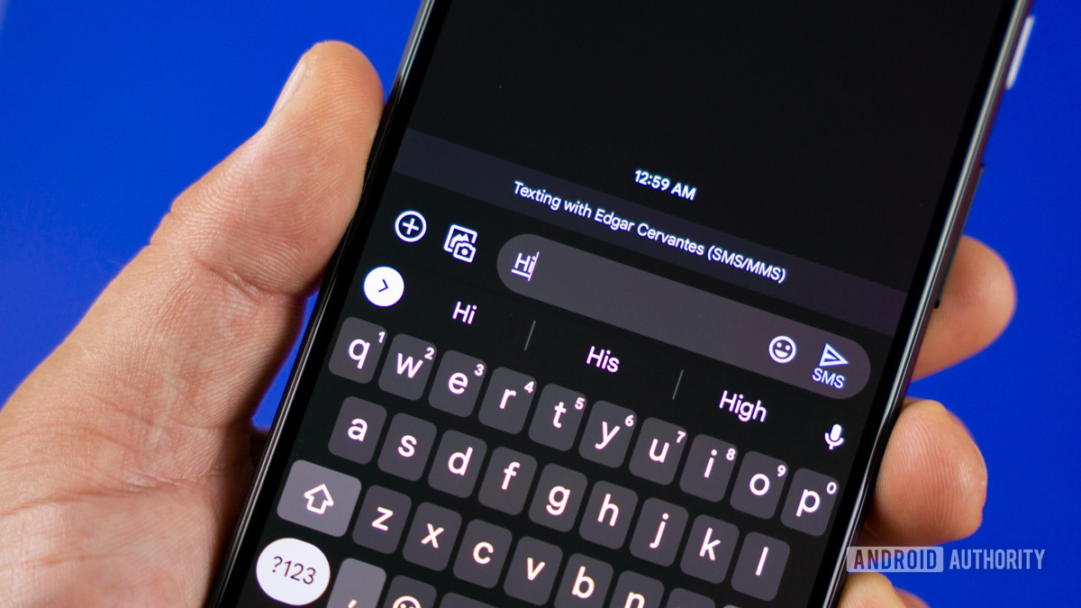
Google Messages is undergoing updates to its profile section and chat compose area, with more elements using the Material You theme. The changes include repositioning icons and improving the overall messaging experience. These updates are currently hidden behind feature flags and not yet available to users, but they could roll out soon.